Flutter初心者の学習記録 第16回:Flutter基本ウィジェット - TextとButton
 Jimmy Zhao
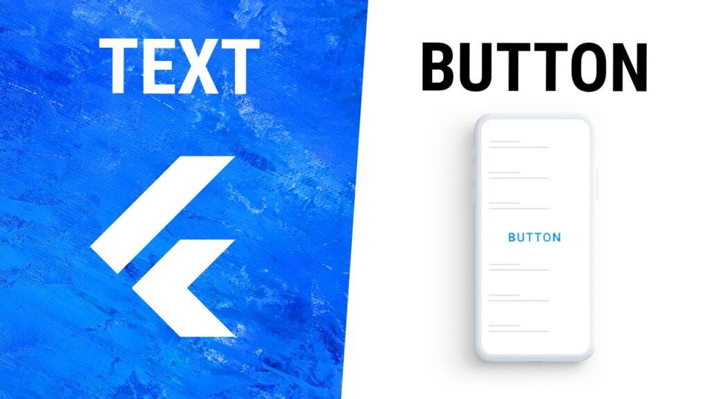
こんにちは、Flutterエンジニアの皆さん!今回は、Flutterアプリ開発における最も基本的なウィジェットである「Text」と「Button」について詳しく解説します。これらのウィジェットはほぼすべてのアプリで使用されるため、しっかりと理解しておくことが重要です。
Textウィジェット
TextウィジェットはFlutterで最も基本的なウィジェットの一つであり、画面にテキストを表示するために使用されます。
基本的な使い方
Text('こんにちは、Flutter!')
このシンプルなコードで画面に「こんにちは、Flutter!」というテキストが表示されます。
テキストのスタイル設定
styleパラメータを使用することで、テキストの見た目をカスタマイズできます。
Text(
  'スタイル付きテキスト',
  style: TextStyle(
    fontSize: 24.0,
    fontWeight: FontWeight.bold,
    color: Colors.blue,
    fontFamily: 'Roboto',
  ),
)
テキストの配置
TextAlignプロパティを使って、テキストの配置を設定できます:
Text(
  '中央に配置されたテキスト',
  textAlign: TextAlign.center,
  style: TextStyle(fontSize: 16.0),
)
配置オプションには以下があります:
TextAlign.left: 左揃え(デフォルト)TextAlign.center: 中央揃えTextAlign.right: 右揃えTextAlign.justify: 両端揃え
テキストのオーバーフロー処理
テキストが長すぎる場合の処理方法を指定できます:
Text(
  '長いテキストが画面の幅を超える場合、このようにオーバーフロー処理を設定できます。',
  overflow: TextOverflow.ellipsis,
  maxLines: 2,
)
主なオーバーフローオプション:
TextOverflow.clip: テキストを切り取るTextOverflow.ellipsis: 末尾に「...」を表示TextOverflow.fade: テキストをフェードアウト
Buttonウィジェット
Flutterには様々な種類のボタンウィジェットがあります。ここでは主要なものを紹介します。
ElevatedButton
立体的な見た目のボタンで、マテリアルデザインに準拠しています。
ElevatedButton(
  child: Text('押してください'),
  onPressed: () {
    // ボタンが押されたときの処理
    print('ボタンが押されました');
  },
)
TextButton
フラットなテキストボタンです。
TextButton(
  child: Text('テキストボタン'),
  onPressed: () {
    // ボタンが押されたときの処理
  },
)
OutlinedButton
枠線付きのボタンです。
OutlinedButton(
  child: Text('枠線付きボタン'),
  onPressed: () {
    // ボタンが押されたときの処理
  },
)
ボタンのカスタマイズ
スタイルを使用してボタンの見た目をカスタマイズできます:
ElevatedButton(
  style: ElevatedButton.styleFrom(
    backgroundColor: Colors.green,
    foregroundColor: Colors.white,
    padding: EdgeInsets.symmetric(horizontal: 20, vertical: 10),
    shape: RoundedRectangleBorder(
      borderRadius: BorderRadius.circular(20),
    ),
  ),
  onPressed: () {
    // ボタンが押されたときの処理
  },
  child: Text('カスタムボタン'),
)
ボタンを無効にする
onPressedパラメータにnullを設定することで、ボタンを無効状態にできます:
ElevatedButton(
  onPressed: null, // ボタンが無効になります
  child: Text('無効なボタン'),
)
実践的な例
以下は、TextとButtonウィジェットを組み合わせた簡単なカウンターアプリの例です:
import 'package:flutter/material.dart';

void main() {
  runApp(MyApp());
}

class MyApp extends StatelessWidget {
  @override
  Widget build(BuildContext context) {
    return MaterialApp(
      title: 'テキストとボタンの例',
      theme: ThemeData(
        primarySwatch: Colors.blue,
      ),
      home: CounterPage(),
    );
  }
}

class CounterPage extends StatefulWidget {
  @override
  _CounterPageState createState() => _CounterPageState();
}

class _CounterPageState extends State<CounterPage> {
  int _counter = 0;

  void _incrementCounter() {
    setState(() {
      _counter++;
    });
  }

  @override
  Widget build(BuildContext context) {
    return Scaffold(
      appBar: AppBar(
        title: Text('カウンターアプリ'),
      ),
      body: Center(
        child: Column(
          mainAxisAlignment: MainAxisAlignment.center,
          children: <Widget>[
            Text(
              'ボタンを押した回数:',
              style: TextStyle(fontSize: 18),
            ),
            Text(
              '$_counter',
              style: TextStyle(
                fontSize: 48,
                fontWeight: FontWeight.bold,
                color: Colors.blue,
              ),
            ),
            SizedBox(height: 20),
            Row(
              mainAxisAlignment: MainAxisAlignment.center,
              children: [
                ElevatedButton(
                  onPressed: _incrementCounter,
                  child: Text('カウントアップ'),
                ),
                SizedBox(width: 20),
                ElevatedButton(
                  style: ElevatedButton.styleFrom(
                    backgroundColor: Colors.red,
                  ),
                  onPressed: () {
                    setState(() {
                      _counter = 0;
                    });
                  },
                  child: Text('リセット'),
                ),
              ],
            ),
          ],
        ),
      ),
    );
  }
}
まとめ
今回は、Flutterの基本的なウィジェットである「Text」と「Button」について解説しました。これらのウィジェットはシンプルですが、適切に使いこなすことで魅力的なユーザーインターフェースを構築する基礎となります。
- Textウィジェット:テキストの表示に使用され、スタイル、配置、オーバーフロー処理などをカスタマイズできます。
- Buttonウィジェット:ユーザーの操作を受け付けるために使用され、ElevatedButton、TextButton、OutlinedButtonなど様々なスタイルがあります。
質問やコメントがありましたら、下のコメント欄にお気軽に投稿してください。みなさんのFlutter学習をサポートできることを嬉しく思います。
それでは、また次回お会いしましょう!